Hartsfield-Jackson Atlanta International Airport
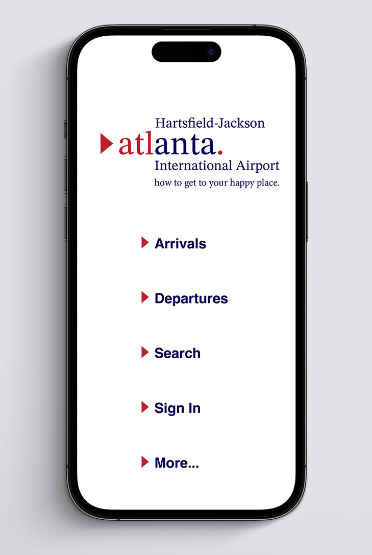
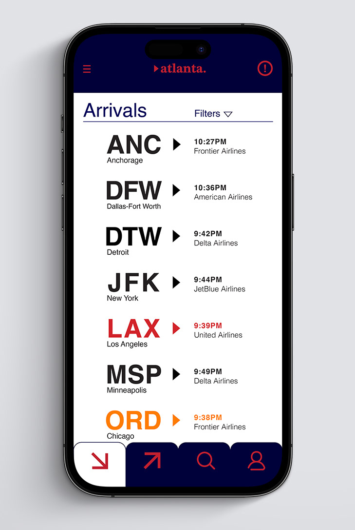
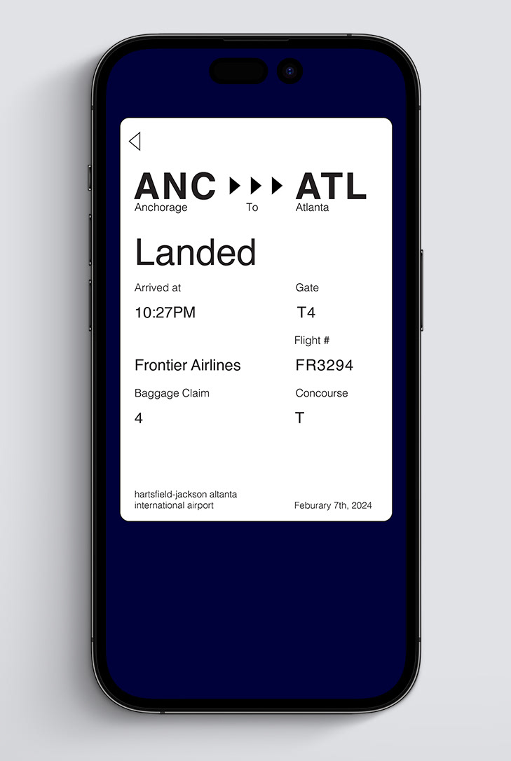
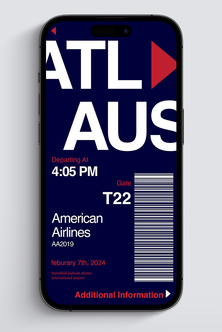
A redesign of the Hartsfield-Jackson Atlanta International Airport, using typography and grids to make a successful and user friendly concept. A main focus was making it easy to read for people with visual impairment or other vision issues like Cataracts, Eye floaters, and Macular degeneration.
Research and Process work
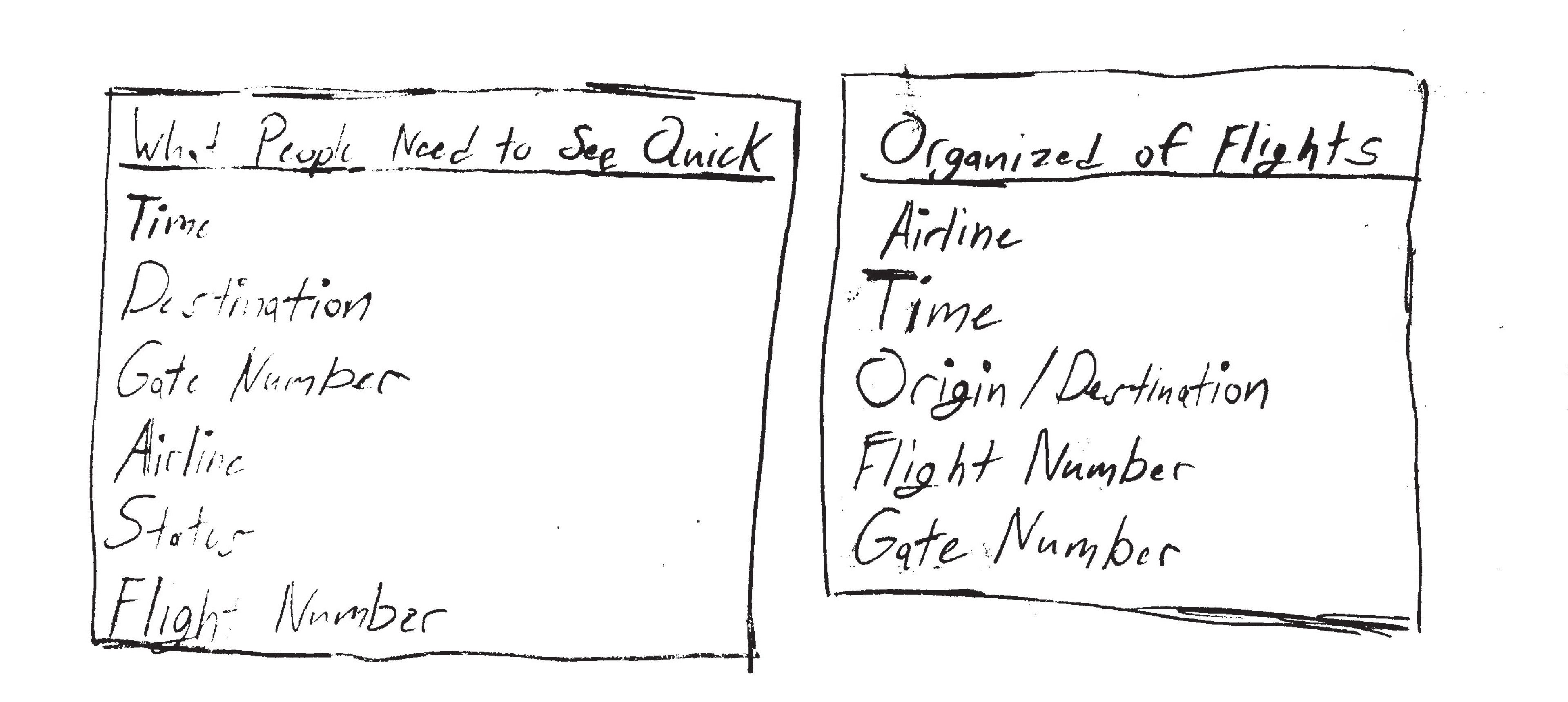
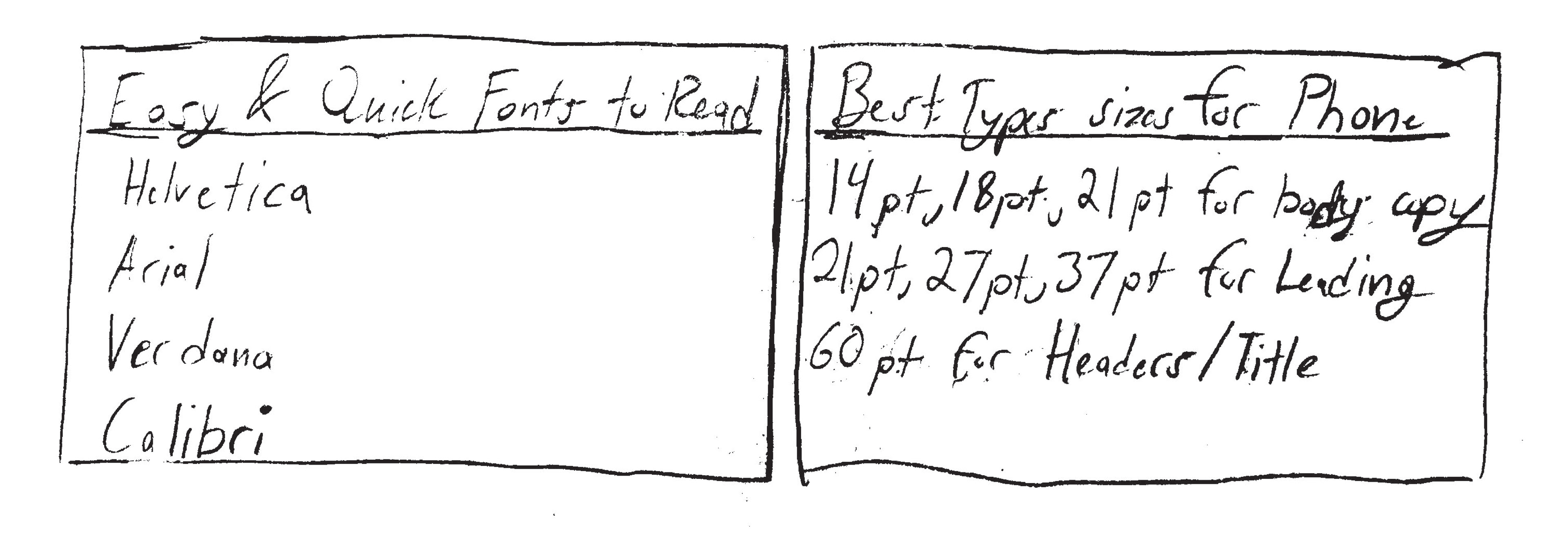
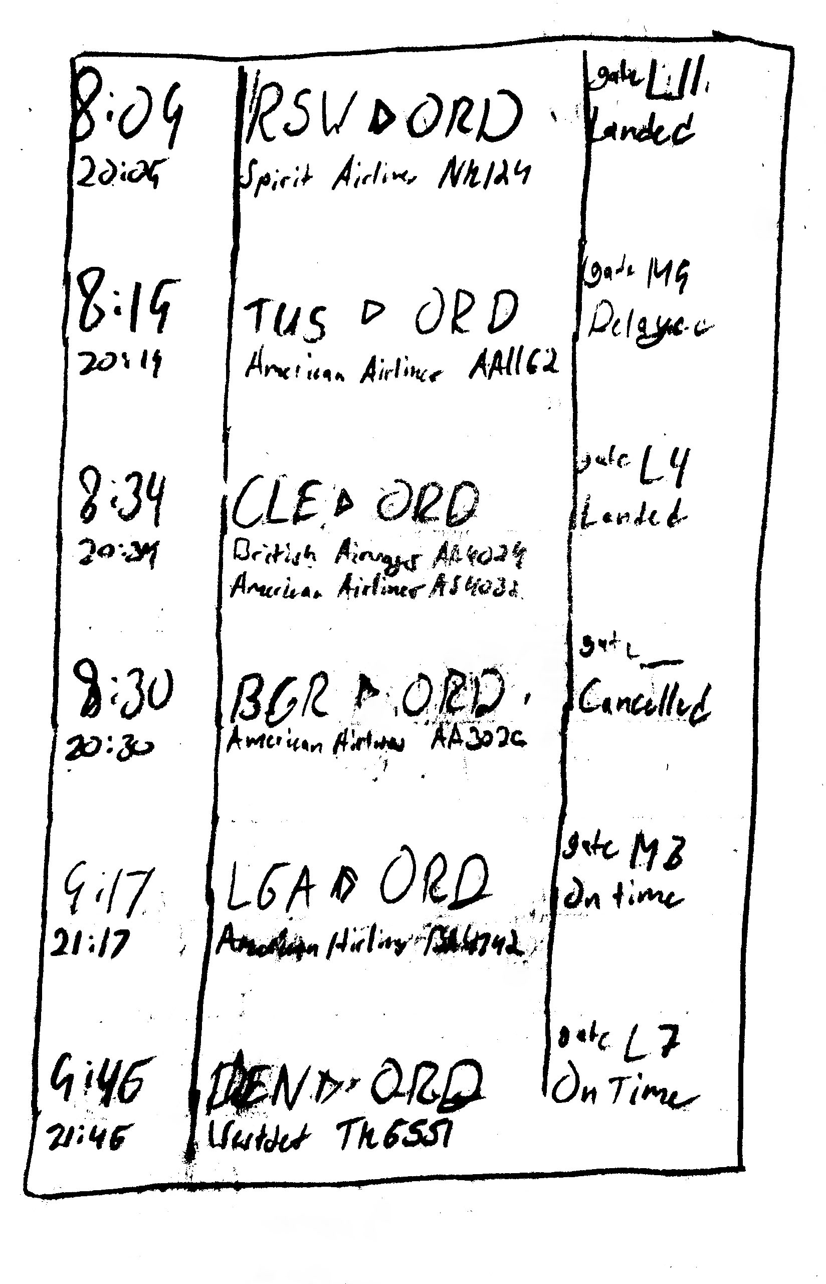
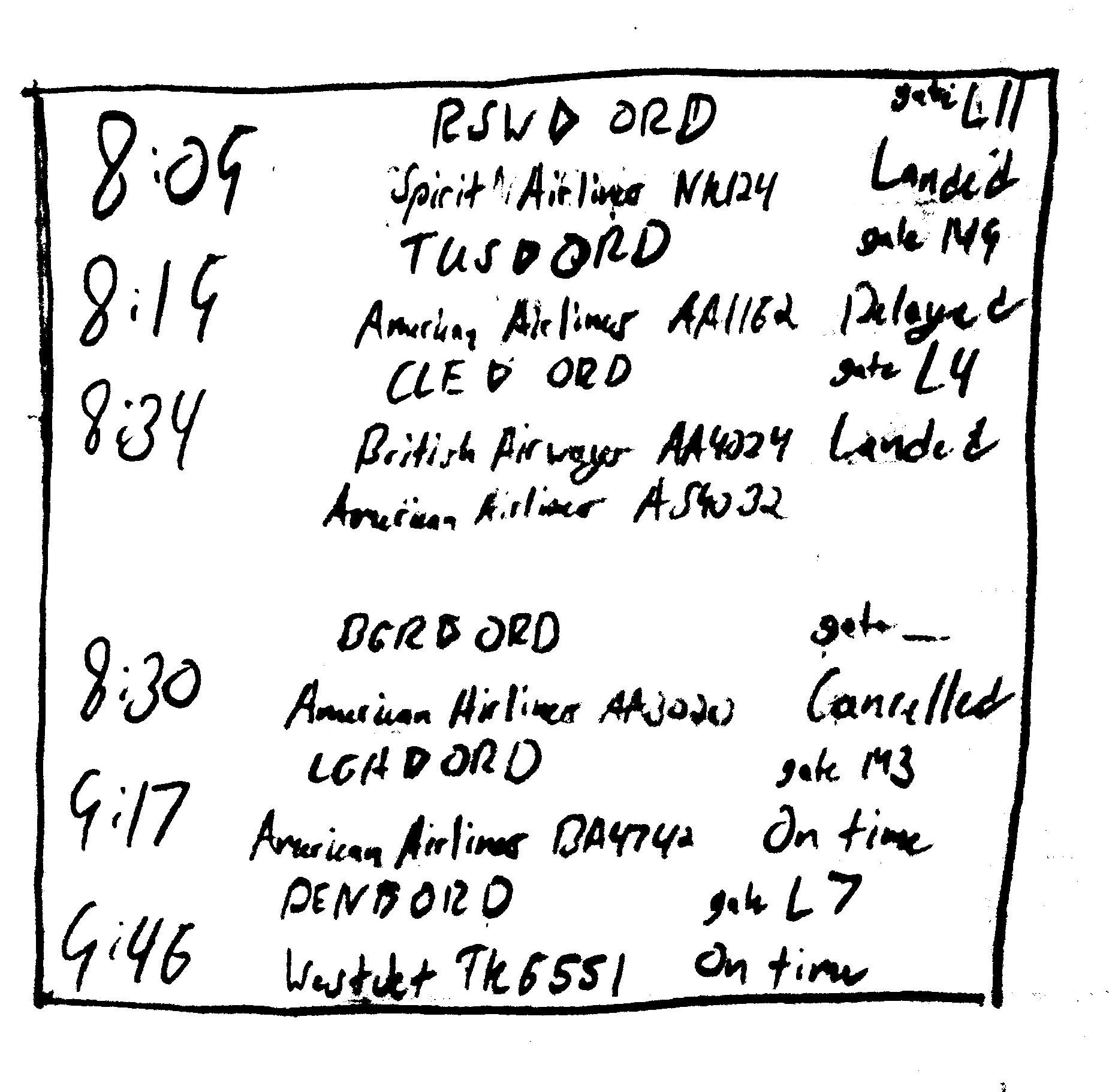
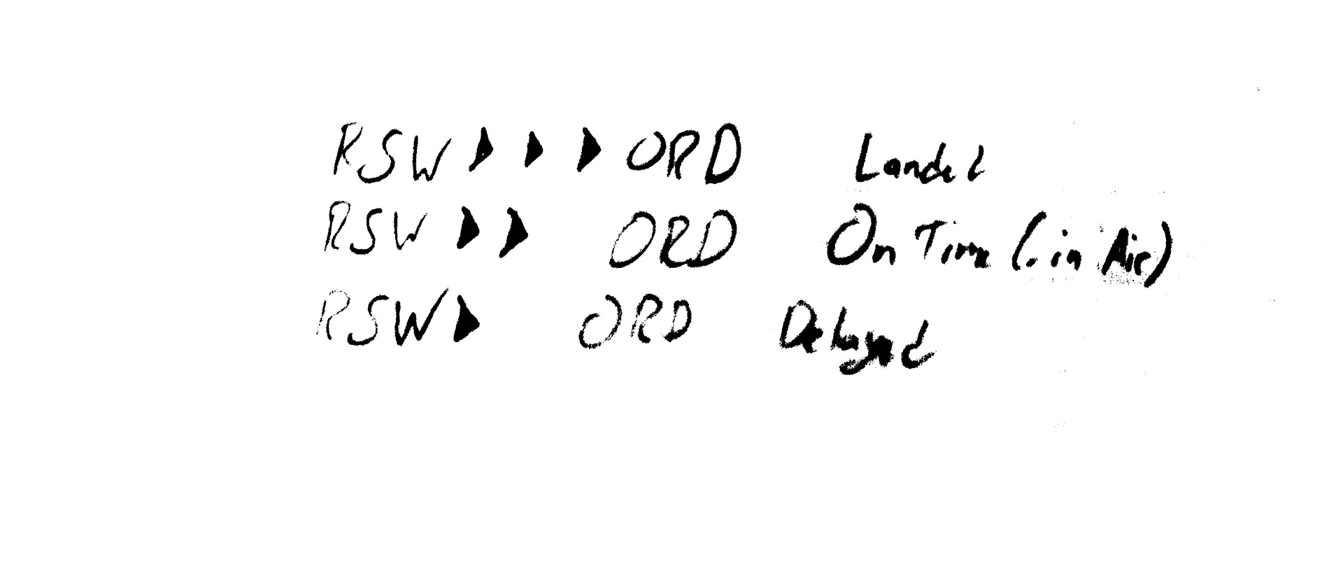
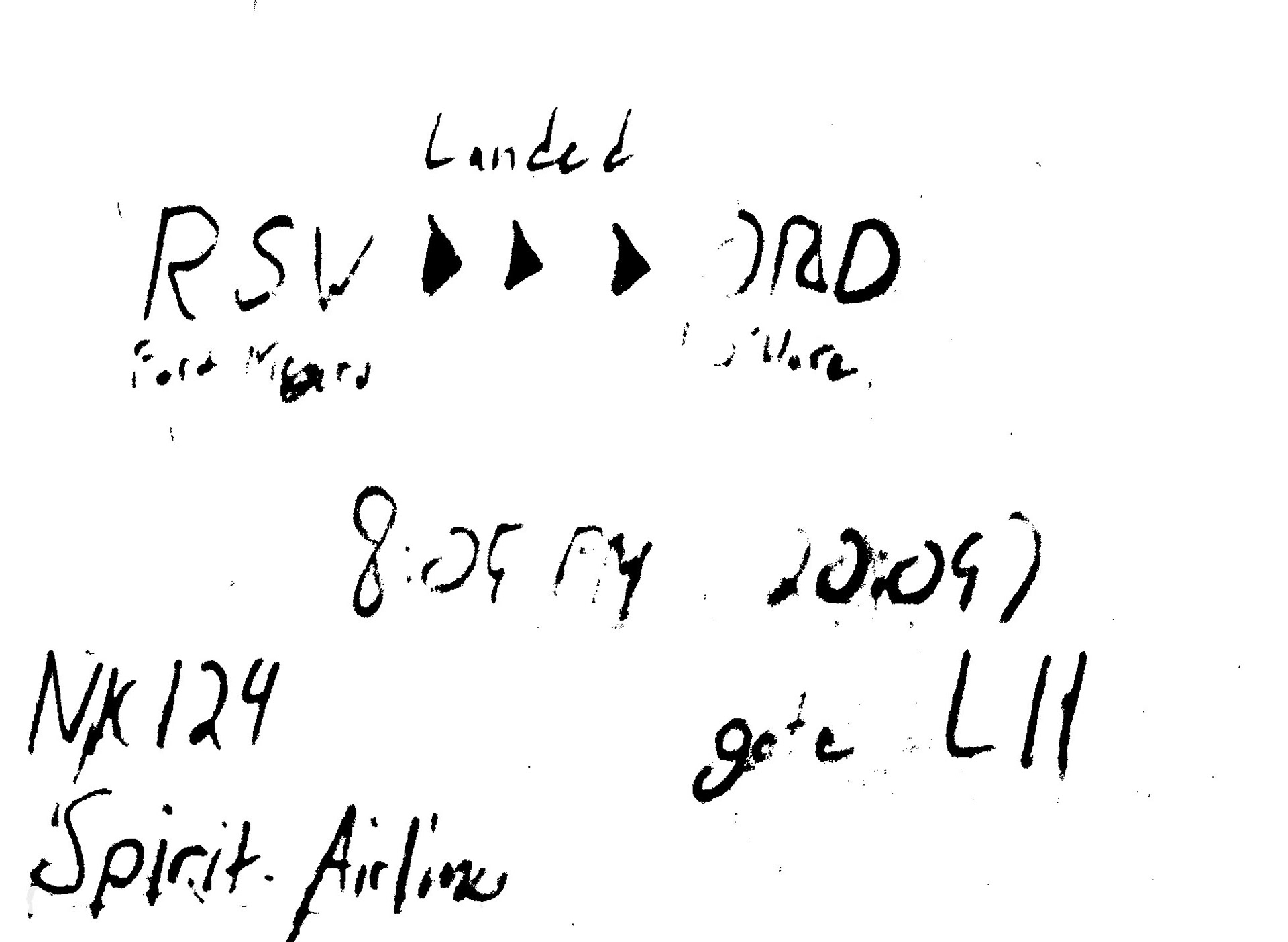
Using data and other airport websites, I found what people need to see quickly and help them process it so that they have an idea of where they need to be, at what time, at what gate, etc. I also research different ways of organizing flights, to help people find their flights quicker. I also researched Easy to read typefaces and the best font sizes for a website or mobile device to make it easy for people who may have visual impairment, or people that do not have good eye sight.
I experimented with the different ways of organizing flights, fonts, and type sizes to find the right size, typeface, font, and best way of organizing.
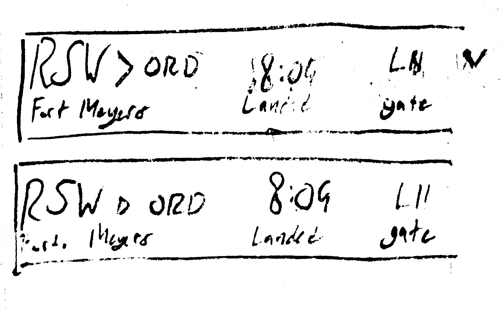
Digital Iterations
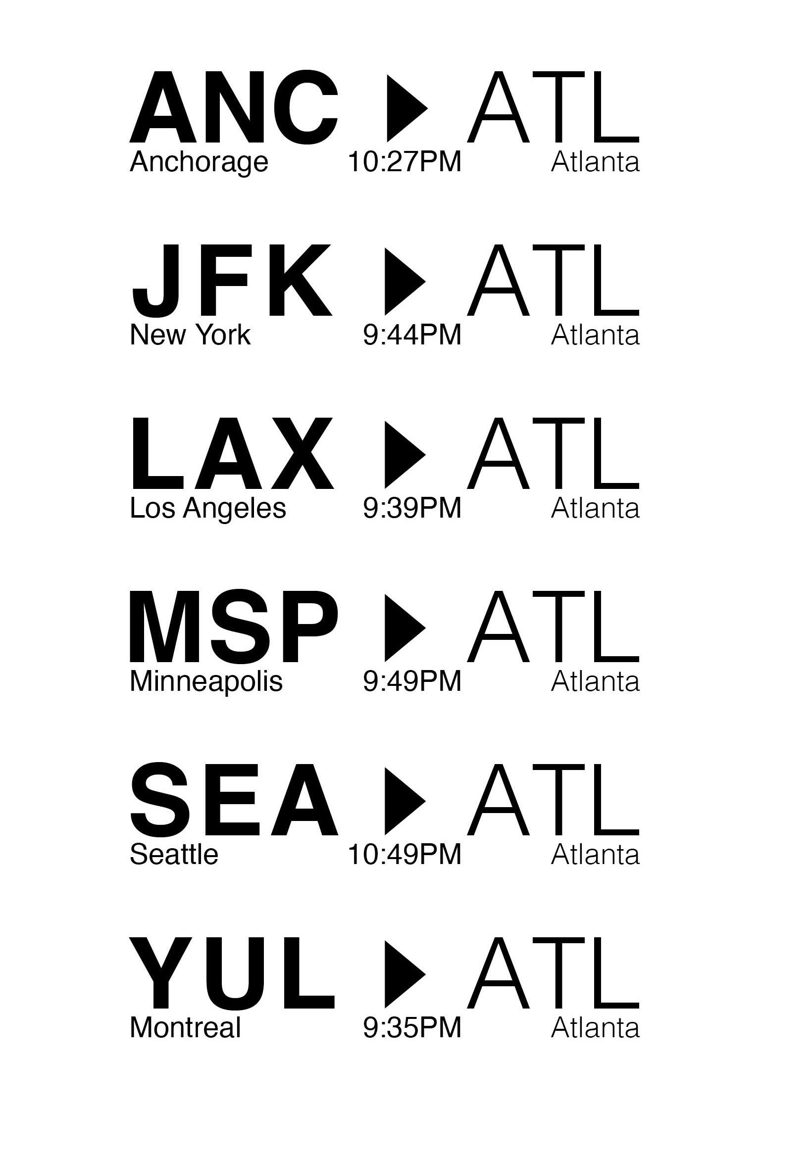
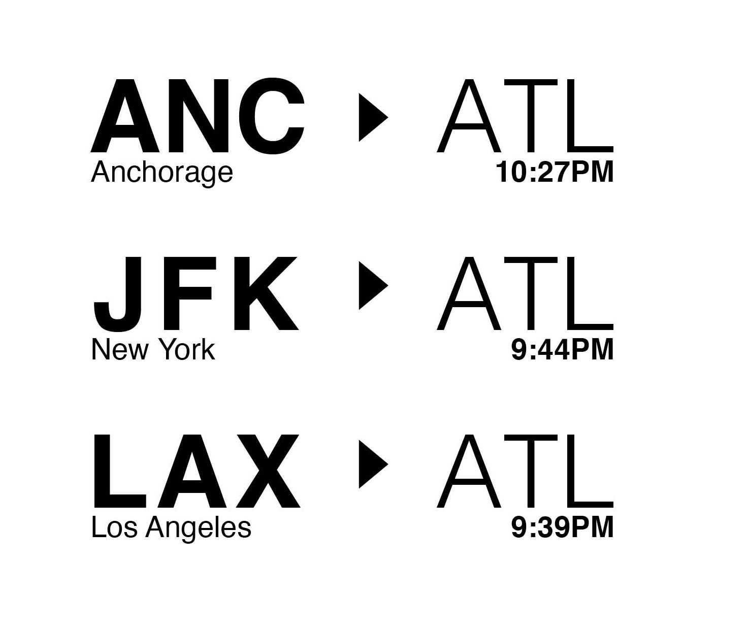
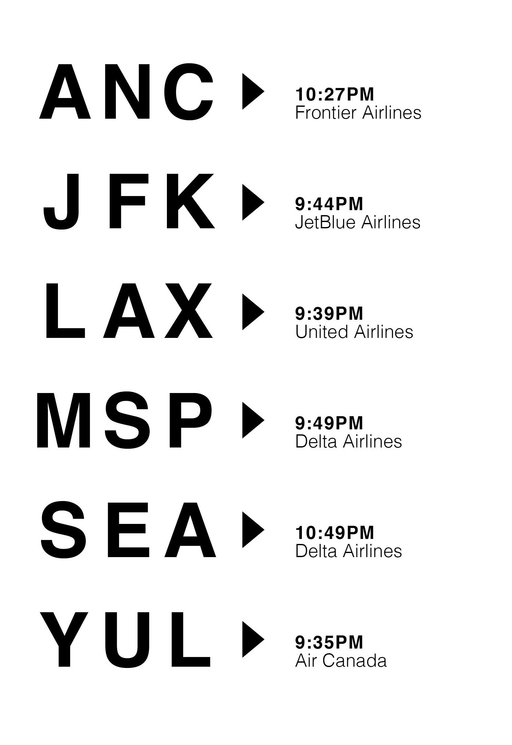
Color Scheme, Fonts, and Icons
Final Design
